Visible’s account experience was driving customers into support and dragging down NPS and LTV.
Teams across the org had conflicting views on what was broken, but no unified picture. Converging insights and audits revealed a systemic failure in onboarding, information architecture, and reliability.
My role
Led cross-team discovery to align on root account issues. Synthesized research across product, data, care, and design and ran user tests. Produced 8+ design iterations that set the direction for a 3‑month redesign.
Scope
Redesign the account experience in 3 months based on cross-team data and trends while exploring new brand aesthetics for the experience. Revisit fundamental assumptions, diagnose key points of friction.
Problem + Process
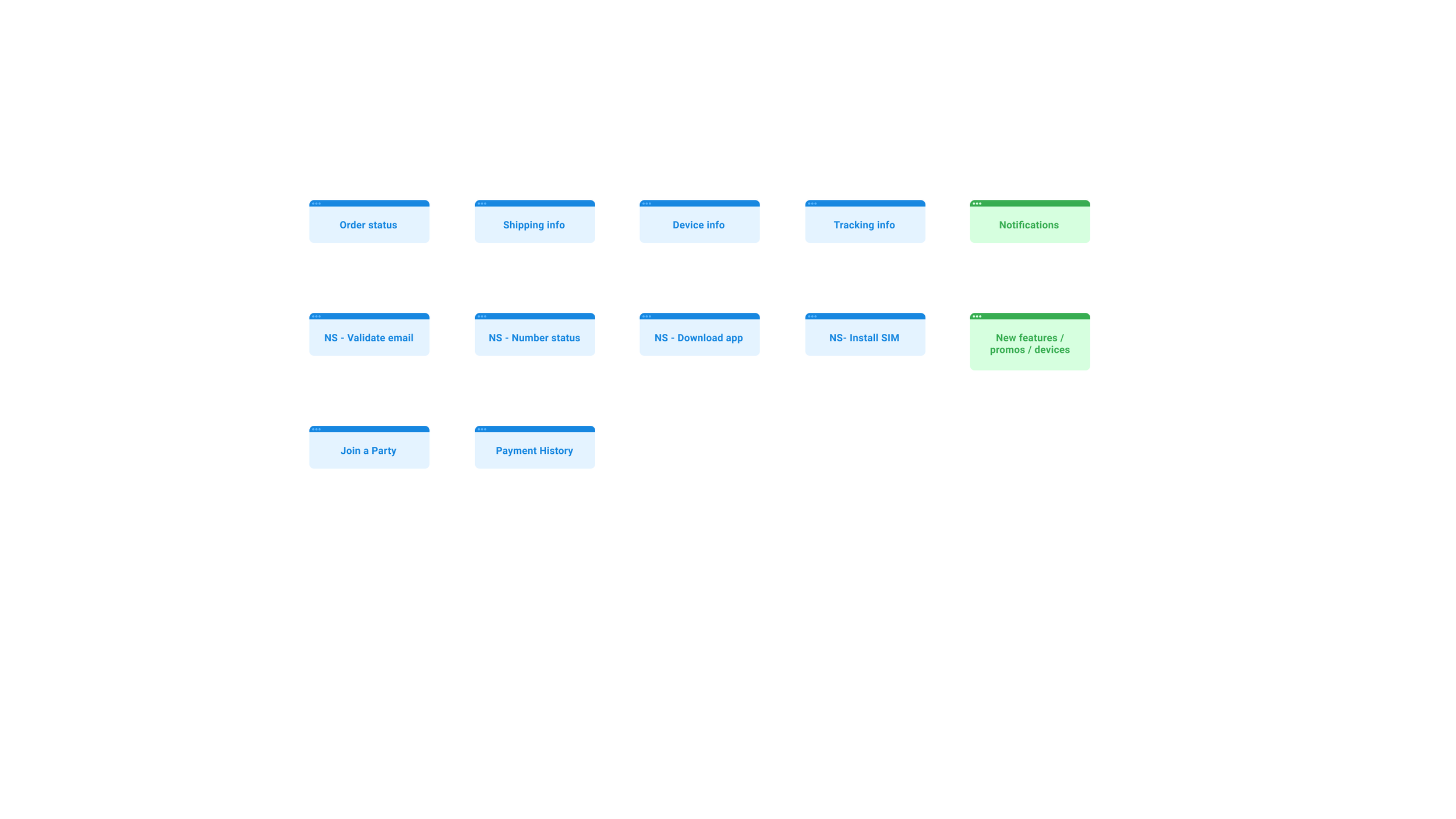
We were asked to redesign the account experience to solve the onboarding experience. But I found that the expectation was set before the user landed in their account page for the first time.
-
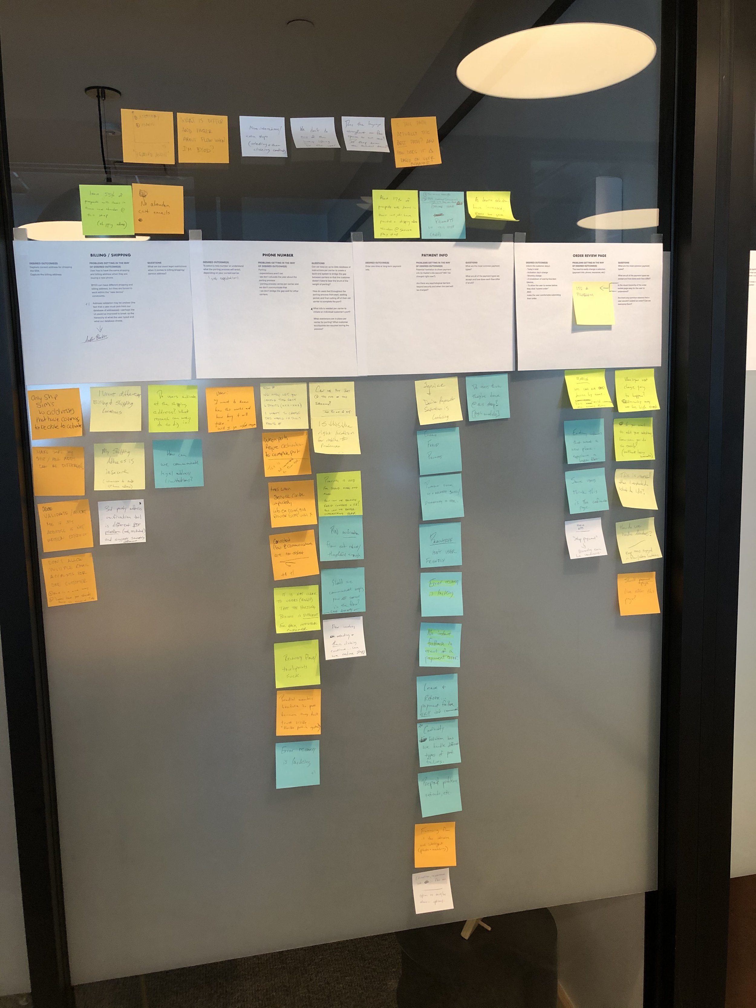
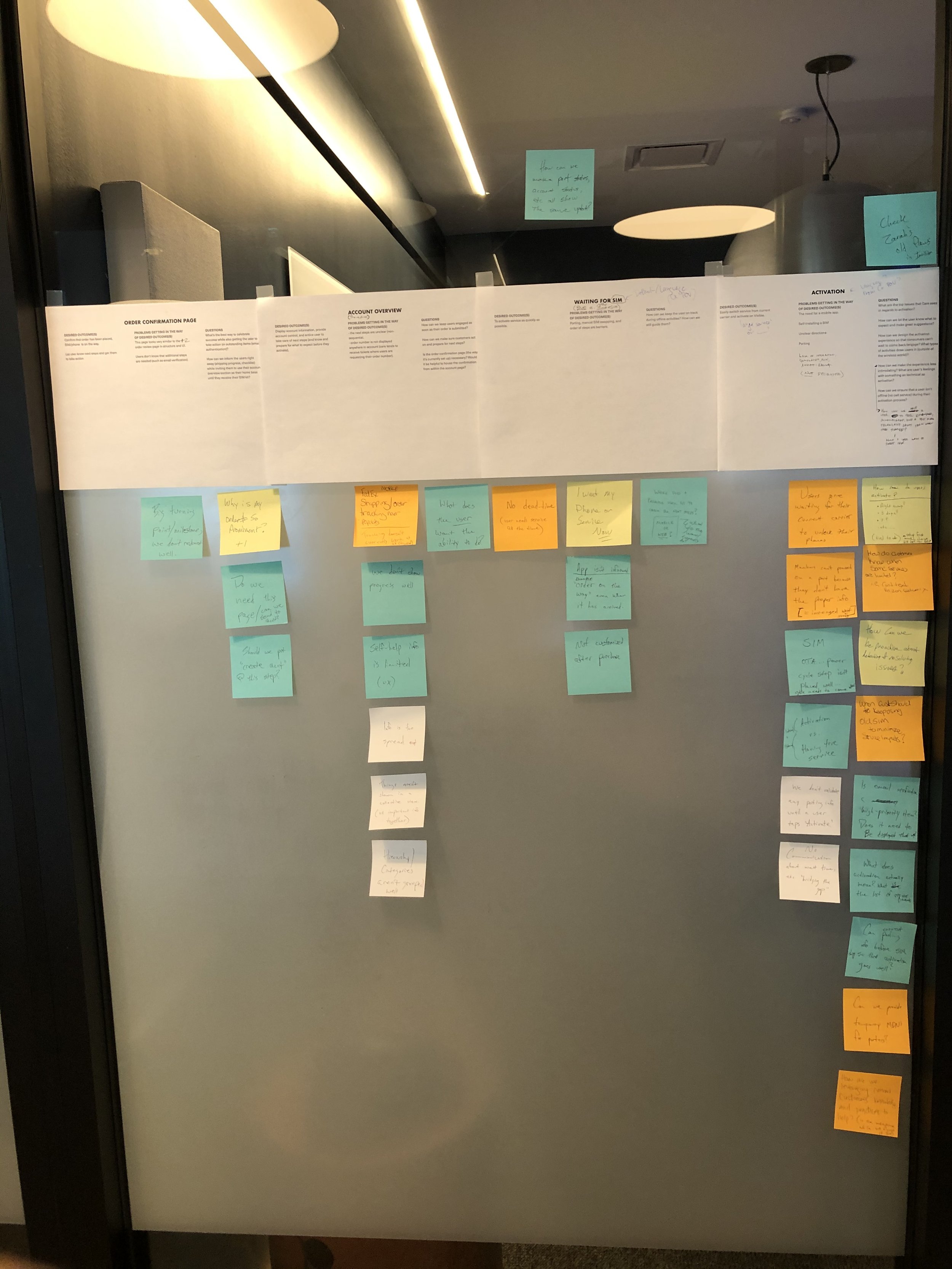
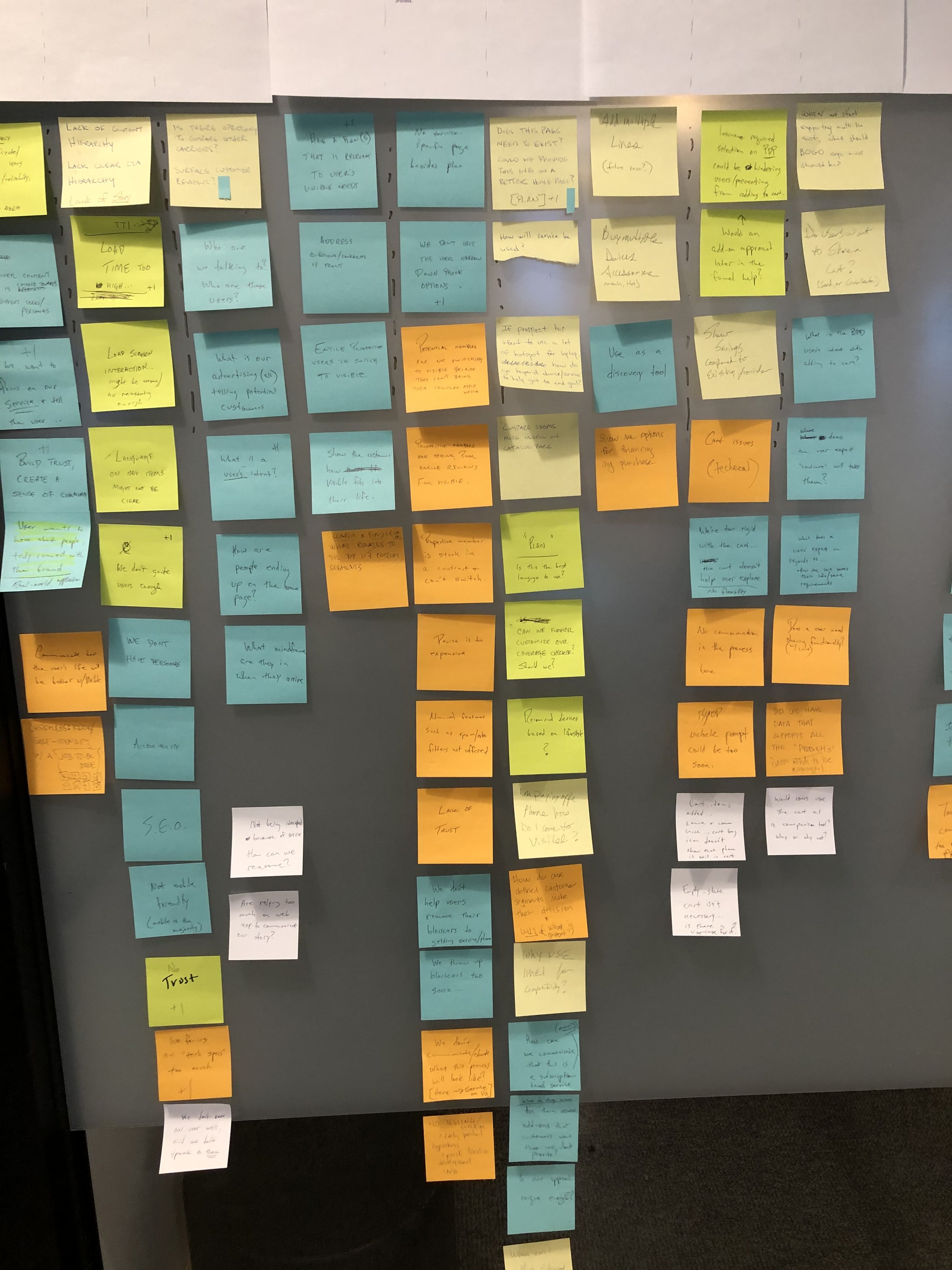
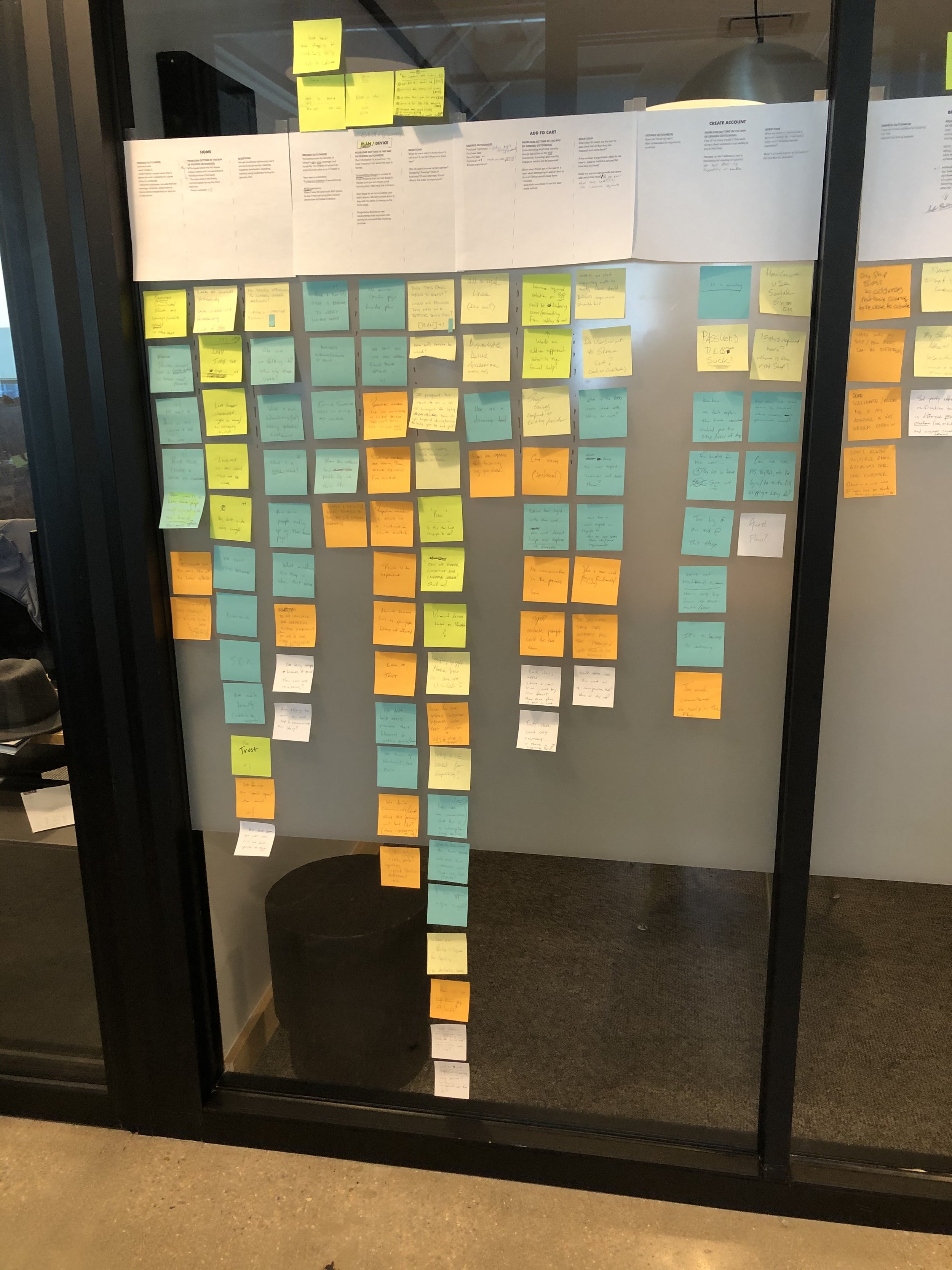
I chose to run an in-office mapping exercise to unify insights from across the company.
I intentionally held this exercise in a 1:1 fashion. Throughout my career, I’ve found that 1:1 sessions allow me to extract a higher quantity and quality of insight per person.
-
Past account user test data
On-staff data resource used to zoom in on key areas where we needed quant data to fill in gaps before running a new round of user tests.
-
The site had bugs, redundancies, and poor architecture.
I ran a site audit. to give the team a single source of truth on how the company web experience was currently stitched together.


-
POST PURCHASE PAIN
The journey map, analytics, and customer feedback exposed a clear lack of guidance directly after the customer purchase of new service. Users didn’t know what to do as they waited for their new SIM card to ship.
-

AMBIGUOUS NEXT STEPS
When it came to porting (transferring a cell number from one carrier to another), and shipping expectations, users had limited feedback from our systems.
-

LIMITED SUPPORT AVENUES
The customer success team was the only avenue for help. Without a phone number to call and without a physical office location, it presented a new way of managing cell service issues that customers weren’t yet accustomed to.
-

BILLING MANAGEMENT IS A PRIORITY
Once customers set up new service, billing and upgrading their phone(s) was a key priority and the core reason they opened the app.
-

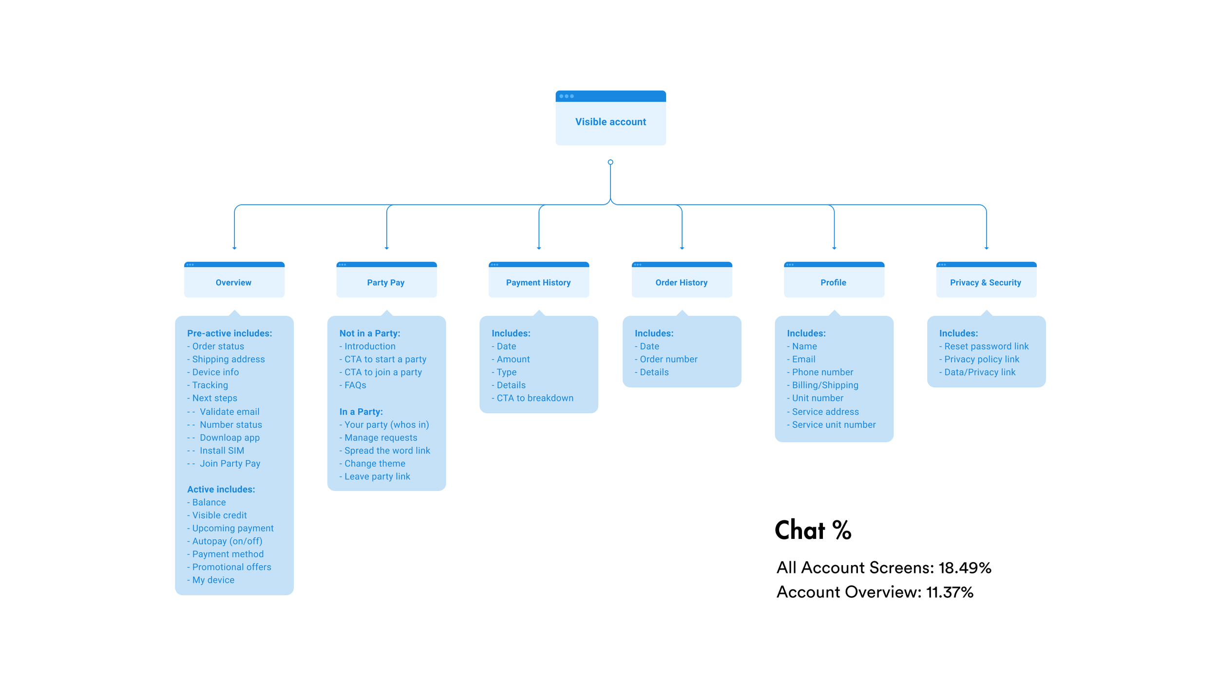
MOST HELP CHATS INITIATE FROM 'OVERVIEW' PAGE
The overview page was the default landing page for users upon logging in. Data showed that users were logging in and opening the help chat right away.
-

THE INTERFACE FELT "CHEAP"
Even though Visible is a value carrier, the product and marketing teams wanted to exude “clean simplicity” throughout the app so much so that users would be overwhelmed with the perceived value of the app and the brand as a whole.
-
![]()
PreActive Card Sort
-
![]()
Active Card Sort
-
![]()
Current Account
-
![]()
New Account - V1
-
![]()
New Account - V2
-
![]()
New Account - V3


THE DESIGN ITERATIONS
Armed with an abundance of knowledge, I contributed to a new visual exploration of the app that would take into account the information architecture and feature changes around better “next steps” guidance.

“Next Steps”
I began to inject a new, “lighter” visual direction while creating post-purchase guidance from scratch.
Exploration #
1
Focus
Next Steps


“Cards, Imagery, and Space”
Early stakeholder interviews uncovered a desire for an app that felt, “more fun to explore and open multiple times per day.” This exploration combined this desire with a light, nimble design.
Exploration #
2
Focus
Explore minimalism


“Discovery and Feature Exploration”
This stage put more focus on a focal, “explore” experience that would house yet-to-be-defined features meant to engage and entice users to continue using the app.
Exploration
3
Focus
Wireframe feature exploration


“Further Feature Refinement”
After getting the thumbs up on the previous pass, I began to integrate components of the current app with our new layout and feature adds to the “discovery” section.
Exploration
4
Focus
Thumbs up, further refine


“Combine and Boost Fidelity”
For this final pass, I paired with another designer to combine our concepts and take the redesign to the final prototype phase.
Exploration
5
Focus
High-fidelity final mockups


THE RESULTS
POSITIVE TESTING WITH USERS
The new account app concept tested positively amongst multiple user testing panels. I leveraged unmoderated testing using usertesting.com. Since deadlines are king, posting a test in the morning and having results in the afternoon while you continue to work on other things is tremendously valuable. Some key results are shown below:
THE RESULTS
18% INCREASE
…in ease-of-use ratings.

THE RESULTS
11% INCREASE
…in task completion speed related to bill pay and account management.

THE RESULTS
43% INCREASE
…in positive-attribute design descriptions by test participants.

CONCLUSION
A VETTED DIRECTION
The new direction for Visible’s core app experience and account redesign fixed fundamental UX issues and gave the app more personality in order to boost engagement and brand approval within the core experience. The redesign tested positively amongst users.
A clear, vetted direction was ready.
Despite extensive work to gain buy-in, and agreements from all departments, the project was put on hold. Around this time, several designers, including our own Head of Design left the company in search of roles with other companies.